We were excited to participate in the first ever ASCO virtual annual meeting last week. Although we missed the in-person interactions, we did not miss the travelling, and it was great to hear about all the exciting developments in cancer research from the comfort of our own homes!
As communications professionals, we were also excited to learn how the meeting functioned in cyberspace, and especially to evaluate any implications for optimizing medical communication in future meetings.
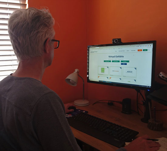
Perhaps the most stark challenge was for the exhibitors. How do you translate the experience of strolling around the exhibition area looking for eye-catching information into an on-demand world of clicking and browsing?
We saw plenty of different approaches. Each of the exhibitors was assigned some virtual floorspace, distinguished only by the amount of real estate on the virtual exhibit page. Apart from the logo and company name, there was no way for an attendee to know what they were going to get when they clicked through.
The virtual exhibits all had a similar format – a header image, a brief description of the company and then a series of links. Some companies took a minimalist approach, with a list of links to resources, product websites and prescribing information. Some took it a stage further with thematic videos after the links. Some, but not all, provided ready access to ASCO posters on company-sponsored research or other news items.
Some exhibits attempted to provide a virtual booth experience. These were reached via a link from the exhibit, and often were designed to replicate the experience of visiting a physical booth. The faithfulness to the real experience varied. The best, we felt, were those that creatively mixed realistic and fully virtual interactivity – for example, a circular booth that made it easier to reach what you were looking for quickly. Some very nice booths skilfully mixed the ‘simulated booth’ format with graphical menu systems to make navigation smooth and seamless.
What we really missed was clear signposting. With so much content, it is really important to know what is on the end of a link to encourage users to go down the rabbit hole. Is it going to be a website, a PDF or a video? If it leads to a website or content area, what type of content and information will I find there? Even simple flags like telling the user how long a video will be can help me to decide whether I spend my time there (and sometimes I am looking for a longer, in-depth video rather than a short, superficial one). A final thought: we were surprised that no company took the plunge with chatbots. Perhaps the timelines were too short to develop them, but if ever there was an opportunity for chatbots to help guide the user to material they want, this was it!